Winna.com (Bet Info Modal)
Enhancing Mobile and Desktop Bet Detail Views for Better Readability, Context, and Action
This redesign focused on transforming the bet detail modal for Winna.com, with a particular emphasis on mobile usability. The original layout presented useful information but lacked hierarchy, visual clarity, and brand engagement. The final result is a cleaner, more structured design that balances essential details with promotional value, thus improving both the user experience and conversion flow. Key changes included reorganizing information, optimizing spacing, applying a clear visual hierarchy, and aligning with the overall brand voice.
Process
Project Goal
The main goal was to make the Bet Detail modal more user-friendly, especially on mobile, where space is limited and users quickly scan for key information. The redesign aimed to compress and prioritize content logically, showing the game title, bet amount, payout, multiplier, and actions, while still offering branding touchpoints, shareability, and transparency. We wanted to create a modal that would not only inform but encourage further engagement (like replays or repeat bets), while staying responsive and compact.
Research Methods
UI/UX Audit of the original modal across devices
Heuristic review of visual hierarchy, white space, and contrast
Competitor Analysis
Key Findings
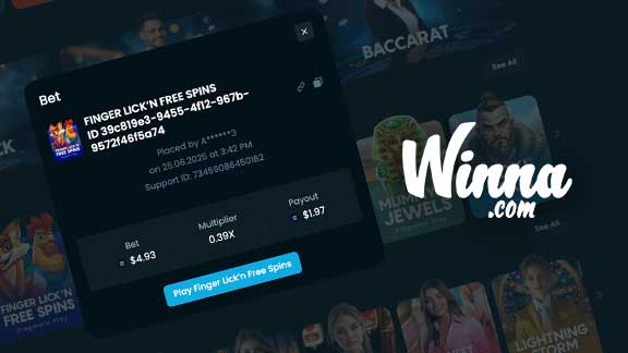
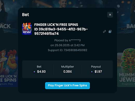
The title hierarchy and formatting lacked polish and branding consistency
Game identity was reduced to raw text and UUIDs, which are hard to read and unmemorable
Player names were masked, losing the opportunity for personalization or brand alignment
Layout felt technical and cold — missing engaging visual cues or imagery
Button hierarchy was unclear and lacked contrast/spacing
Redundant elements like full UUIDs and support IDs cluttered the modal
Overall, it lacked visual grouping, resulting in low readability and poor mobile performance
Action Points
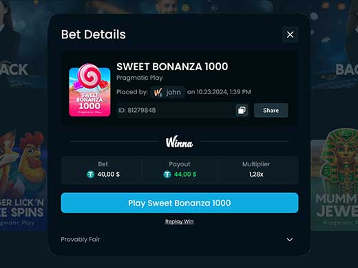
Replaced plain text title with clear game card UI, featuring game logo, color, and title
Added a more clear “Share” button for social proof opportunities
Integrated Winna logo branding for trust and consistency
Applied clean, separated layout for Bet, Payout, Multiplier using iconography and alignment
Ensured all key information fits compactly for mobile screen sizes with clear tap targets
Added "Play Again" and “Replay Win” buttons to drive re-engagement
Solution Proposal
The redesigned modal replaces the plain text title with a visually rich game card UI, showcasing the game’s logo, color scheme, and title to immediately capture attention and create brand alignment. A prominent “Share” button was introduced to encourage social proof and organic engagement. To reinforce trust, the Winna logo was seamlessly integrated into the layout, grounding the design in brand identity. The core betting information(Bet, Payout, and Multiplier) is now presented in a clean, segmented layout using intuitive iconography and consistent alignment, making it easy to scan. Key action buttons like “Play Again” and “Replay Win” were added to drive user re-engagement and create a smoother conversion path. The entire layout was thoughtfully compressed and optimized for mobile, ensuring that all elements remain readable and interactive, with tap-friendly zones and no unnecessary scrolling.
Results & Impact
Better visual hierarchy
Clearler sections
Emphasised Branding