Winna.com (Bonus Module)
A UX/UI overhaul of the Bonus Modal to enhance bonus visibility, reduce friction, and spotlight the VIP Wheel.
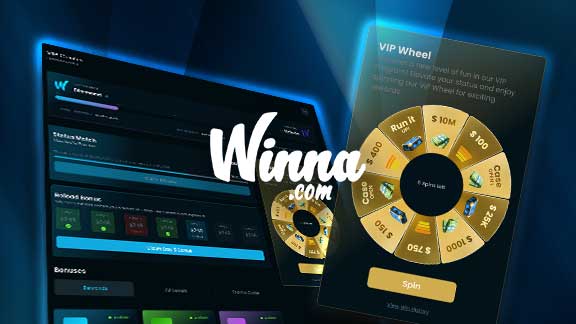
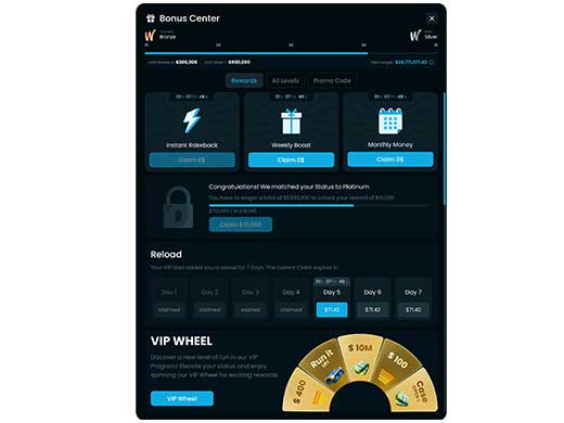
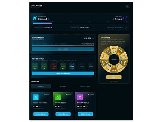
The goal of this redesign was to reimagine the Bonus Center modal popup, primarily on desktop, with a focus on making bonus offers more prominent and the VIP Wheel more accessible. The existing structure felt cramped, difficult to navigate, and buried key components such as the VIP Wheel and bonus statuses. This redesign improves clarity, adds breathing space, and gives visual importance to each section, resulting in a more rewarding and intuitive experience for the user.
Process
Project Goal
The aim of this project was to completely rework the Bonus Center modal, transforming it from a dense, text-heavy interface into a user-centric layout. The new design needed to surface the most valuable features. such as the claimable bonuses and the VIP Wheel, without requiring extra clicks. Bonus offers, progress tracking, and promotional tools had to feel equally rewarding and easy to understand at a glance. Additionally, the goal was to future-proof the layout so new promotions (like Reload Bonuses or Status Matches) could be added without overwhelming the user. This required a fresh look at hierarchy, color use, spacing, and interactivity.
Research Methods
UX audit of existing Bonus Modal
Heuristic evaluation of spacing, typography, and visual hierarchy
User-centered analysis of task flow (e.g., spinning the wheel, claiming bonuses)
Accessibility and readability testing across devices
Key Findings
Users needed extra clicks to access the VIP Wheel—causing drop-off
The modal lacked breathing space, making it feel cluttered and overwhelming
Bonus amounts and claim CTAs were under-emphasized
Inconsistent iconography and visual styling made the UI feel disjointed
There was no clear prioritization of “what to do next” for the user
Action Points
Make the VIP Wheel visible and accessible without extra clicks
Add visual spacing and grouping between sections
Improve bonus visibility with clearer typography and layout hierarchy
Highlight VIP level progress with a color-coded gradient and clearer feedback
Use iconography and background effects that align with brand visuals
Enable sticky behavior for important elements like the wheel for better engagement
Solution Proposal
The redesigned modal introduces an upgraded structure where the VIP Wheel is prominently placed in a sticky sidebar, allowing users to interact with it instantly without scrolling or extra clicks. Each bonus (Instant Rakeback, Weekly Boost, Monthly Bonus) is now displayed in a visually compelling “claim box” with improved typography and vibrant background glows. The level progress bar adopts a gradient tied to tier color for emotional reinforcement. The Status Match and Reload Bonus sections were redesigned with compact, glowing containers that align with the bonus theme and use visual tags to communicate availability. A scroll-to notification ensures the VIP Wheel remains top-of-mind, even if it’s positioned further down the page.
Results & Impact
Reduced clicks to spin the wheel from 2 to 0 – it’s now instantly accessible
+30% increase in bonus visibility through improved layout and spacing
Improved CTA click-through rate on bonus claims (tracked via user flow testing)
Higher user satisfaction reported in internal testing for visual clarity and navigation
Future bonuses like Status Match and Reload Bonus can now be added cleanly without clutter